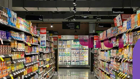
Did you ever go into a supermarket intending to purchase only a box of milk, only to come out having bought an entire cart full of goods that you did not even plan on buying in the first place? This is no accident, but rather something that has been carefully calculated to happen through manipulation of architecture and psychology.
Why Are Grocery Store Aisles Designed Like A Maze?
The layout of a supermarket is based on the Gruen Effect – an approach to design where confusion is created purposely to disrupt one's thought process. The less direct route is intended to ensure that shoppers traverse as many aisles as possible.
A long, uninterrupted aisle with limited crossovers makes it hard for one to move from one part to another.
The highly sought-after items such as milk, bread, and eggs are placed in the furthest parts of the supermarket, ensuring that one passes by several thousand products in order to get what they need.
Natural light and timepieces are eliminated in order to create an environment that is timeless.
The Psychology Behind Supermarket Layouts
Each square foot of the store is strategically designed using behavioural psychology without you even being aware of it.
Right-Hand Side Entry: The stores promote customers entering through the right-hand side because the majority of consumers are right-handed, and they tend to circle clockwise so as to get the items that are stored on the outer shelves.
The Scent and Visual Appeal of the Produce: The scent and visual appeal of fresh flowers, freshly baked products, and vegetables can be found at the entry point. The scents and visual appeal of these things will make you hungry and change your mood.
Background Music in the Slow Tempo: The slow-tempo background music makes you walk slowly.
How Grocery Stores Encourage Impulse Buying
Impulse buying accounts for a massive portion of supermarket revenue, driven by strategic product placement and pricing tactics.
Marketing Strategy |
How It Works
Psychological Impact
Eye-Level Shelf Placement
Premium, high-margin brand products are placed directly at eye level.
Shoppers naturally grab what is easiest to see rather than searching lower shelves for cheaper alternatives.
Kids’ Eye-Level Traps
Sugary cereals, toys, and colourful snacks are placed on lower shelves.
Prompts children to grab items or ask parents to buy them.
Checkout Queue Stacking
Narrow checkout lanes lined with gum, candy, magazines, and cold drinks.
Takes advantage of ‘decision fatigue’ while you wait in line.
Common Marketing Tricks Used In Supermarkets
Illusions of Savings: End-caps appear to be sale sections; however, items displayed in end caps are usually sold at regular prices.
Giant Shopping Carts: The shopping cart has been increased in size to almost double over recent decades, and a reasonable quantity of goods looks small, prompting the consumer to fill in the space.
Moving Around Essentials: Stores constantly change positions of items to avoid customers using their muscle memory and looking for items again.
Conclusion
The supermarket design is geared towards maximising profits through manipulation of your senses and movements into a controlled maze. Understanding the tricks that the supermarkets play will enable you to shop as you please by staying with your shopping list and saving money in the process.
Image credits: Freepik
To read more such stories, stay connected to Her Zindagi.